

Designing COVID-19 Data Tools
This issue of JSGS Policy Brief is part of a series dedicated to exploring and providing evidence-based analysis, policy ideas, recommendations and research conclusions on the various dimensions of the pandemic, as it relates here in Canada and internationally.
By Petr Baranovskiy, Master of Public Policy Graduate, Johnson Shoyama Graduate School; Ken Coates, Canada Research Chair in Regional Innovation and JSGS Professor; Carin Holroyd, Associate Professor of Political Studies, University of SaskatchewanSince mid-March, Canadians have followed the advance and, thankfully, the retreat of the coronavirus with worry and fear. These days, we sit in front our computers, clicking on an endless variety of charts, maps, newspaper articles, video interviews and reports that document, in front of our eyes, the raging pandemic.
Around the world, citizens are clamouring for information, seeking clarity in the midst of one of the most confusing and unpredictable medical events in modern history. To an impressive degree, Canadians have followed their political leaders and public health officials obediently and with a general suspension of criticism. In countries around the world, citizens have adhered to lockdown strategies and unprecedented restrictions on movements, all of which are tied to government interpretations of statistical information and forecasts of future developments. Few people are familiar with the oftenreproduced charts and tables of the experienced and predicted spike in infections and deaths, seeking to understand how “flattening the curve” works in practice.
Public access to data has been more constrained than data scientists anticipated following the advent of the Internet and ubiquitous cloud storage. At a time of crisis, as with the Coronavirus pandemic, it seems particularly important that governments make appropriate data available to the public. It falls, further, to non-government professionals—academics, journalists, data specialists—to format and present the data in ways that contribute to public understanding.
Charting the spread of the disease caused by the SARS-CoV-2 virus is serious business, for it affirms or, in the case of the United States of America, condemns government attempts to control the pandemic or, in the new vernacular of 2020, to “flatten the curve.” These presentations are only as valuable as the data upon which they are based. And in the early weeks of the pandemic, the world suffered through the lack of personal protection equipment, inadequacy of medical reports, and an acute shortage of tests, all caused by the lack of pandemic readiness planning. Additional challenges were, and still are posed by our limited understanding of the biological progression of the disease. In relatively short order, governments have improved the adequacy of reporting (deaths are more accurately recorded than the number of people suffering from the disease, although even those usually don’t include people dying at home).
The public is not starved for information; indeed, with the national media understandably obsessed about the pandemic, there is a danger of over-saturation. The information is now coming fast and furious, with routine explanations of current rates of infection and disease-related deaths, the availability (or shortage) of key medical supplies, insightful explanations of the jurisdiction’s placement on the disease curve, and cumulative statistics on the medical and human consequences of the pandemic.
The obvious downside of the information deluge in the media is that it is messy, confusing, not systematic, and rarely allows the user any degree of control over the information. While top government officials can receive their updates from briefings provided to them by epidemiologists and can ask specific questions that will be promptly answered, the majority of public servants, researchers, and citizens do not have this kind of access to specialist advice. They will be relying on the data published by the government, primarily online.
Here we will lay out some ideas about the design and implementation of online data tools intended to break down, analyse, and communicate (usually through visualization) official data about pandemics, economic disruptions, and other high-impact events and processes. By “data” we mean highly structured information, usually quantitative or convertible to quantitative, that can be broken down into clearly defined variables.
To put these ideas in context, we present the COVID-19 Canada Data Explorer. It was developed by Petr Baranovskiy, a Master of Public Policy graduate from the Johnson Shoyama Graduate School of Public Policy at the University of Saskatchewan. COVID-19 Canada Data Explorer (CDE) provides a regularly updated interactive dashboard showing the progress of the coronavirus across Canada. Petr’s work, which was undertaken on a voluntary basis, is the kind of publicly available, accurate and timely data source needed for politicians, public servants and the general public as they strive to make sense of the pandemic. We hope it will help policy development and implementation, and public information during the time of pandemic.
Figure 1: COVID-19 Canada Data Explorer
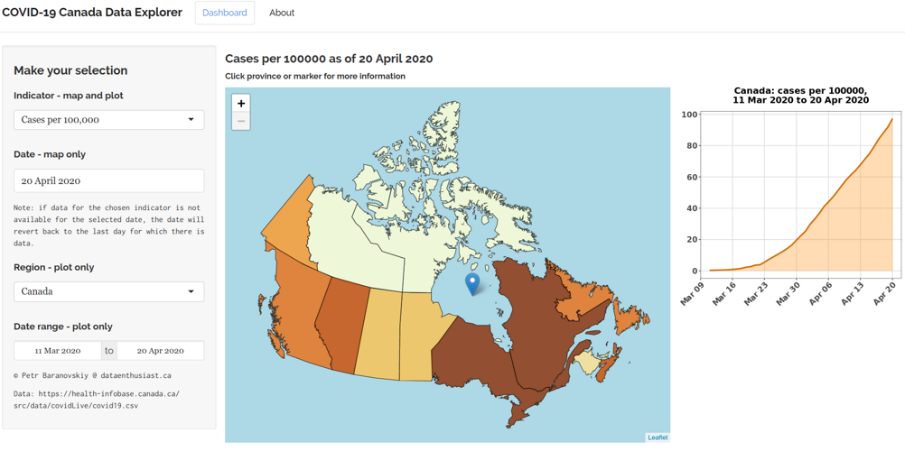
Found online: http://dataenthusiast.ca:3838/covid_ca/
Let’s illustrate the use of the CDE with a simple example. Suppose you are a journalist who needs to find out the epidemiological situation in Canada on a given day. So you go to the dashboard and choose the “Total cases” indicator and the date you are interested in, let’s say, April 28, 2020:
Figure 2: Total Cases in Quebec as of April 28, 2020
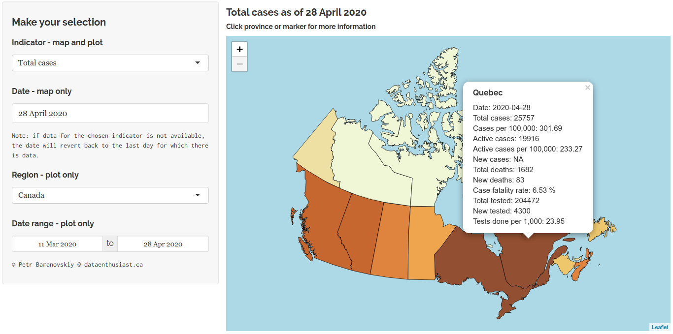
Immediately you can see that Ontario and Quebec had the largest total number of cases, and by clicking those provinces on the map, you find out that the number of cases was highest in Quebec. Then you realize that the reason why Quebec and Ontario have the most cases is likely because they have the largest populations. So you need the data adjusted for population. The CDE makes it very easy: just choose the “Cases per 100,000” indicator:
Figure 3: Total Cases in Alberta as of April 28, 2020
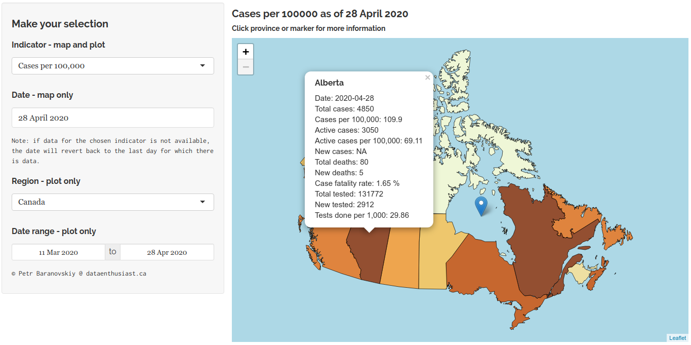
Now you can see that when adjusted for the population size, on April 28, 2020 the two most affected provinces were Quebec (which still was the first) and Alberta. And if you are wondering about what exactly “Total cases” means, you can click the “About” tab at the top of the webpage and find out that the “Total cases” means all cases since the start of the epidemic, i.e. cumulative cases. Note that the map’s title will conveniently refer to the indicator and the date you’ve selected.
Let’s now say you are interested in how the epidemic has been progressing in Saskatchewan, and whether it is maybe time to “reopen” the province for business. It would be logical to rely on the “New cases” indicator for that:
Figure 4: New cases in Saskatchewan, March 11 to April 28, 2020
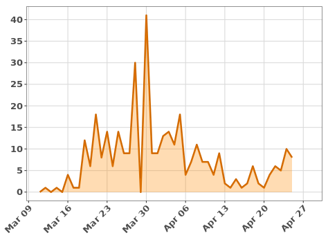
You can see that the peak was in late March, but you may want a more detailed look at how the epidemic progressed in April. For that, simply adjust the “Date range” input:
Figure 5: New cases in Saskatchewan, April 1 to April 28, 2020
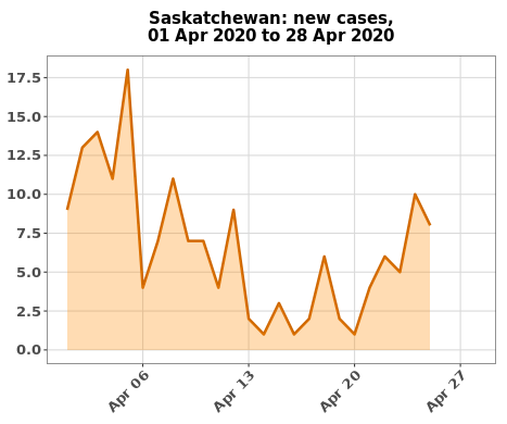
You can see that from April 12 to about April 22, the new cases of COVID-19 in Saskatchewan stayed in low single-digit numbers, but then started going up again. Note also that as of the moment of this writing, the federal government has not updated its dataset on the number of new cases since April 25, which is why the plot doesn’t quite reach all the way to April 28.
Based on all this information, one can likely conclude that the best strategy would be to wait and observe for a little while longer before deciding whether it is time to reopen, and when the time comes, to reopen in stages so that the process can be slowed or halted if necessary.
The characteristics of data analysis instruments are determined by their intended purpose and expected users. The purpose is to break down, analyze, and communicate the official data about high-impact events and processes. As for the users, since we are dealing with high-impact events, this category is very broad and includes virtually everyone: policymakers, public servants, the media, researchers and the specialist community, and the general public.
First, data tools should allow for a high degree of control over the data, which is particularly important for policymakers, public servants, researchers, and the media:
- The user should be able to break down the data by all, or at least most, indicators that are typically used to describe events or processes of a specific type. For instance, in case of an epidemic, you should ideally be able to break down the data by the total number of cases, active cases, new cases daily, total number of deaths, new deaths daily, and case fatality rates (cases per unit of population, e.g. per 100,000). If testing is available, the indicators should also include the information on the total number of tests, new tests done daily, and the number of tests performed per unit of population.
- If the event or process has a spatial dimension, it should be possible to break down the data by geography, e.g. by state or province, and, ideally, at the sub-provincial level by health regions and communities. The best way to achieve this would be with an interactive map.
- In case a process develops over time, the tool should be able to create snapshots of the situation on a given day, and to visualize how the situation was developing during a user-defined period of time.
The data should be easy to understand and interpret. Normally, visualizations should be preferred over tabular data or text, and such visualizations should be simple, clear, and intuitive. They should avoid using fancy or overly complex graphics. This is important for all categories of users.
Raw data should also be available for download. This applies to the tools developed by the government or the academic institutions, as only they have the ability to collect such data. This is particularly important for researchers and the specialist community. For example, some of the best COVID-19 pandemic tracking tools were developed not by the government or the media, but by academic researchers or by the members of open source community working during their free time. The development of these resources would be impossible without free, timely, and convenient access to data. Besides, even after the pandemic is over, such data should remain available, as it will be invaluable for future research and analysis. Importantly, the data should be available in machine-readable formats such as CSV, Microsoft Excel, or other common tabular formats for non-spatial data; and shapefile, GeoPackage, or geoJSON for spatial data. PDF documents, tables embedded in webpages, maps in the form of JPEG or PNG files, etc., do not meet this requirement as they are not truly machine-readable: retrieving such data for further processing would, in the best case, require a lot of additional effort and time on the part of developers. In the worst case, researchers would avoid using such data due to the amount of time and labor required to make it useful.
So how have Canada’s governments at the federal and provincial levels fared in terms of COVID-19 data reporting? In Canada, the task of tracking the disease has fallen to the Government of Canada and thirteen provincial and territorial governments. The governments are generally doing a good job collecting data about the overall number of COVID-19 cases, new cases, the number of tests done, and the geographic distribution of cases by province/territory or, in case of provincial health authorities, by health regions.
The app, roaches of these sub-national governments to data presentation, however, have varied significantly , om providing only limited and basic information to the intensely engaged, particularly Alberta and British Columbia.
We have reviewed all the official COVID-19 data reporting tools available from the federal and provincial governments in Canada and made the following comparative table. Those tools that meet more than half of the requirements listed above were marked as “functional”, while the rest were marked as “basic”. Note also that some provinces that were marked as not having datasets in machine-readable format might actually have the data available for download. However, we were not able to find such data upon close inspection of their official COVID-19 pages. To be useful, the data needs to be easy to find.
| Overview of COVID-19 Data Reporting Tools, As of April 26, 2020 | |||
| Region | Basic Webpage or Dashboard* | Functional Webpage or Dasboard* | Dataset in Machine-Readable Format |
| Canada2 | - | ||
| Alberta3 | - | ||
| British Columbia4 | - | ||
| Manitoba5 | - | - | |
| New Brunswick6 | - | - | |
| Newfoundland and Labrador7 | - | - | |
| Nova Scotia8 | - | - | |
| Ontario9, 10, 11 | - | ||
| Prince Edward Island12 | - | - | |
| Quebec13 | - | - | |
| Saskatchewan14 | - | - | |
| "Basic" and "functional" options are mutually exclusive. | |||
As one can see, currently only Alberta and British Columbia offer high-quality, comprehensive COVID-19 reporting and analytical tools at the government level, with Manitoba and Newfoundland and Labrador getting close, although there was some hesitation whether to put their data reporting tools in the “basic” or “functional” category. We did not review COVID-19 data reporting by territorial governments, as they currently have very low to zero (in case of Nunavut) diagnosed infection rates.
There is, as yet, no systematic and focused reporting of the progress of the illness in First Nations, Metis, and Inuit communities – a gap that governments may soon regret, if the kind of outbreak that is happening right now in northwest Saskatchewan occurs in other Indigenous populations. Indigenous communities are extraordinarily vulnerable to pandemics, if only because of intense poverty, overcrowded homes, and the frequent movement of members on and off reserves and home communities.
Conclusion
Making important, time-sensitive data available to the general public is not overly difficult. For example, there is absolutely no need for expensive or highly specialized software to build such tools. The COVID-19 Canada Data Explorer was made using only free and open source software, specifically, the R programming language with “Shiny” and “Leaflet” packages. The same applies to all tools available by the first link in this brief. The Canada Data Explorer is one illustration of how timely nation-wide data can be provided to the country in an accessible, innovative and usable manner.
Readily available data is essential if the country is to have an informed debate about the Coronavirus pandemic and related public policy. People and institutions have hundreds of questions and numerous uncertainties about the government’s response to the epidemic, particularly related to pending decisions about the lifting of restrictions. Canada is doing reasonably well in the management of the pandemic but the uncertainty about current and pending decisions lingers. With accessible and effective data sources, particularly those that provide easily-to-follow visualization of the statistical information, the public can contribute thoughtfully and critically to vital debates about the management of the Coronavirus outbreak and related government policies.
Download the Policy Brief pdf.
ISSN 2369-0224 (Print) ISSN 2369-0232 (Online)
References
1 A collection of links to some of the world’s best COVID-19 data visualization resources created by academic researchers and members of the open source community: https://www.statsandr.com/blog/top-r-resources-on-covid-19-coronavirus/#r-shiny-apps-and-dashboards.
2 https://www.canada.ca/en/public-health/services/diseases/2019-novel-coronavirus-infection.html
3 https://covid19stats.alberta.ca/
4 http://www.bccdc.ca/health-info/diseases-conditions/covid-19/data
5 https://www.gov.mb.ca/covid19/updates/data.html
6 https://www2.gnb.ca/content/gnb/en/corporate/promo/covid-19/maps_graphs.html
7 https://covid-19-newfoundland-and-labrador-gnl.hub.arcgis.com/
8 https://novascotia.ca/coronavirus/data/
9 https://www.ontario.ca/page/2019-novel-coronavirus
10 https://data.ontario.ca/dataset/status-of-covid-19-cases-in-ontario
11 https://data.ontario.ca/dataset/confirmed-positive-cases-of-covid-19-in-ontario
12 https://www.princeedwardisland.ca/en/topic/covid-19
15 https://www.cbc.ca/news/canada/saskatchewan/covid-in-sask-april-27-1.5546728
Petr Baranovskiy

Petr Baranovskiy is a Master of Public Policy graduate and a former researcher from the Johnson Shoyama Graduate School of Public Policy. Petr is an R programming language enthusiast interested in economic policy analysis, economic and statistical modeling, and in using geospatial data for policy analysis. He is the author of the “Working with Statistics Canada Data in R” series and regularly blogs about data analytics and visualization at www.dataenthusiast.ca.
Ken Coates

Ken Coates is a Canada Research Chair in Regional Innovation and Professor at the Johnson Shoyama Graduate School of Public Policy, University of Saskatchewan. He is also the Project Director of the Aboriginal Canadians and the Natural Resource Economy for the Macdonald-Laurier Institute, a national think-tank. He has worked in a variety of fields from world history and Indigenous history to regional economic development and the impact of technology on society.
Carin Holroyd

Carin Holroyd an is Associate Professor, Department of Political Studies, University of Saskatchewan. She is a specialist on Asian political economy and technological innovation in East Asia. Her most recent book is Green Japan: Environmental Technologies, National Innovation, and the Pursuit of Green Growth.